
Google has announced that mobile-first indexing is now rolling out, almost a year and a half since it originally unveiled plans to change the way it ranks mobile and desktop pages. During this time, the search giant has been experimenting and testing the implementation of a mobile-first search experience and now it’s ready to roll out the new system.
There’s also been a lot of talk about mobile-first indexing over the past year and it’s come with a certain degree of confusion and conflicting reports. So, now that Google is officially rolling out mobile-first indexing, we’re going to explain exactly what this means for SEO and what you need to do about it.
What is mobile-first indexing?
Before we give our explanation of mobile-first indexing, let’s look at the description Google offered up when it announced the rollout:
“To recap, our crawling, indexing and ranking systems have typically used the desktop version of a page’s content, which may cause issues for mobile searchers when that version is vastly different from the mobile version. Mobile-first indexing means that we’ll use the mobile version of the page for indexing and ranking, to better help our – primarily mobile – users find what they’re looking for.” – Webmaster Central Blog
That’s about the best quick description of mobile-first indexing that we’ve seen over the past year, including previous Google explanations. Essentially, it all comes down to the fact that the majority of Google searches are made on mobile but the results are still formulated by a system that ranks desktop pages first. The problem is, mobile pages often differ from their desktop alternatives and it makes little sense to send people to pages optimised for desktop when they’re using mobile.
Mobile-first indexing shifts the priority to the mobile version of pages to create better results and experiences for Google’s predominantly mobile users.
This doesn’t mean Google is going mobile-only or creating a separate index for mobile and desktop results. It simply means mobile pages will be crawled first and Google will fall back to desktop if no mobile version is found.
Of course, this raises a few questions and we’re going to address as many of these as we can in the remainder of this article.
What does mobile-first indexing mean for SEO?
Although mobile-indexing sounds like a huge deal that’s going to change the way Google Search operates, the impact on most SEOs and website owners will be minimal. We’re certainly not looking at another mobilegeddon and there’s no need to panic as mobile-first indexing rolls out.
However, it’s important to know whether you will be affected or not, by how much and what you need to do about it. These are the kind of questions we’re going to answer now.
How does mobile-first indexing work?
Back in January, Bridget Randolph gave her answer to this question in an article for the Moz blog. Here’s what she had to say:
“It’s called ‘mobile-first’ because it’s not a mobile-only index: for instance, if a site doesn’t have a mobile-friendly version, the desktop site can still be included in the index. But the lack of a mobile-friendly experience could impact negatively on the rankings of that site, and a site with a better mobile experience would potentially receive a rankings boost even for searchers on a desktop.”
To help illustrate how this works, Bridget included the following visualisation in her article:
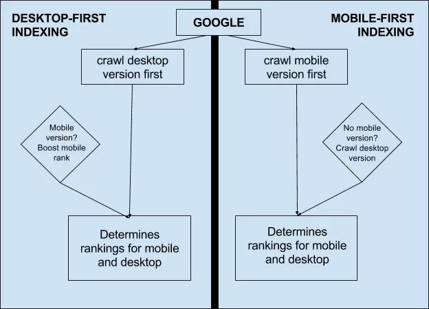
Source: Moz blog, Bridget Randolph
As the graphic shows, mobile-first indexing changes the default behaviour of Google for each search so that it crawls the mobile version of your page when there’s one available. When there isn’t a separate mobile version, Google reverts to indexing your desktop page and determines its ranking as normal.
How will this affect my search ranking?
This depends entirely on how your website and pages are optimised for mobile. Firstly, if your website is designed responsively – in other words, your mobile and desktop pages are one and the same – then you shouldn’t be affected by mobile-first indexing. In these cases, your mobile and desktop pages are the same and simply adapt to accommodate different screen sizes, which is the design approach Google recommends for mobile optimisation.
The websites that’ll be most affected by mobile-first indexing are those that provide separate mobile and desktop pages for users, depending on which device they’re using. In this scenario, the mobile version will now be crawled first and this could impact your search ranking for a number of reasons:
- You serve different content on the mobile and desktop versions of a page
- Your mobile pages lack structured data
- Your mobile pages lack metadata
- The mobile version of a page isn’t correctly verified in Search Console
- The link profiles pointing toward your mobile pages are weaker than the desktop versions
- Your mobile pages are poorly optimised for mobile
Most of the potential problems here come down to poor mobile optimisation so follow the usual best practices and you should be fine. However, there are a couple of technical SEO issues that could cause serious problems if you don’t know what to look out for.
First of all, make sure the mobile and desktop versions of each page are both verified in Search Console. Secondly, the link profile for your mobile pages will be different from their desktop versions, for better or worse. Which means you could see a change in ranking based on the quality of link profiles your mobile pages currently have.
You can find out more best practices for mobile-first indexing at Google Developers and the same page also gives details on how various types of pages might be affected. Here’s a quick summary of the impact mobile-first indexing should have on different websites:
Desktop only
Your site is desktop only and doesn’t have a mobile-friendly version.
No change. The mobile version is the same as the desktop version.
Responsive web design
Your site adjusts for screen size.
No change. The mobile version is the same as the desktop version.
Canonical AMP
All your web pages are created in AMP HTML.
No change. The mobile version is the same as the desktop version.
Separate URLs
Each desktop URL has an equivalent different URL that serves mobile-optimised content. This site type is also known as an m-dot site.
Google prefers the mobile URL for indexing. To prepare for mobile-first indexing, follow our best practices.
Dynamic serving
Your site serves different content based on the user’s device. Users only see one URL.
Google prefers the mobile optimised content for indexing. To prepare for mobile-first indexing, follow our best practices.
AMP and non-AMP
Your site has both AMP and non-AMP versions of a page. Users see two different URLs.
Google prefers the mobile version of the non-AMP URL for indexing. If your non-AMP mobile version uses dynamic serving or separate URLs, follow our best practices.
As you can see, mobile-first indexing should only affect you if you have separate mobile and desktop pages or dynamically serve content – neither of which is recommended, especially dynamic content. However, if you are using either of these methods for mobile optimisation, there are a number of best practices you can follow to minimise the impact of mobile-first indexing.
What should I do ahead of mobile-first indexing?
If you serve separate mobile and desktop pages or use dynamic content delivery for different device types, make sure you have the following covered before mobile-first indexing rolls out.
- Your mobile and desktop pages contain the same content
- Both versions of your page have the necessary structured data
- Both versions of your page have the necessary metadata
- Both versions of your page are verified in Search Console
- Any rel=hreflang tags for internationalisation include separate links for mobile and desktop URLs
- Your servers can handle any increase in crawl rate for the mobile version of your site
- Your robot.txt directives are the same (and optimised) for both desktop and mobile versions
- Correct use of rel=canonical and rel=alternate link elements between mobile and desktop versions
Once again, all of these points are part of the usual mobile optimisation best practices and none of this should be new to you. There’s nothing wrong with having separate mobile and desktop sites, as long as they’re optimised correctly, and – let’s be honest – there are plenty of responsive websites that are poorly optimised for mobile. If it’s going to take a lot of work for you to get your pages ready for mobile-first indexing, then it might make sense to make the jump to a responsive design while you’re at it. However, a well-optimised experience shared across mobile and desktop pages is always going to be better than a poorly optimised responsive experience – so don’t lose sight of the end result for the sake of a more popular process.
How will I know when my site is migrated to mobile-first indexing?
Google will notify you that your site has been migrated over to mobile-first indexing when the time comes, so you won’t be left guessing. You’ll get a message in Search Console telling you that mobile-first indexing has been enabled for your site, which will look something like this:
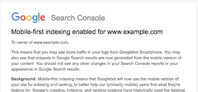
Source: Google Webmaster Central Blog